Got 'em on 14330 kHz at ~2335 GMT.
After posting this, I re-read earlier messages in this thread on the possible delay of the pips themselves. I looked at a bunch of them sequentially in my recording and they vary from around 80 to 110 samples delayed from UTC, in no apparent order. From an earlier description, I was expecting as I went in a direction, that it would increase/decrease by a regular interval. However that was not the case.
For a string of 11 PIPs in a row, this is what was found for the number of samples between UTC PIP (GPS) and the UNID PIP. Since I was eyeballing it, there's is some inaccuracy of the samples but should be within a few samples. These are uncorrected values for the delay of the radio (which at the recorded bandwidth is 6 samples).
117, 124, 101, 94, 98, 104, 110, 95, 116, 126, 100
This is from a pip at delayed 88 samples (corrected for internal radio delay) from UTC. This is equivalent to 1.9955 ms (using 44100 Hz sample rate):
Thanks for the info Skeezix. I will play around a bit with this and see what I come up with.
The variations you saw are about 0.7 msec, and my first assumption would be some mixing / multipath of groundwave and skywave.
Because we (GrahmC, you, me) took different measurements at different times and on different frequencies I would not expect much accuracy, but we should get the general region. Also, you might be ground wave or at most single hop, GrahmC is probably single hop, and I am probably double hop.
I will plot it two ways. The first will assume the pulse is at UTC zero second, the second will assume the start time is in sync with the UTC second, but not starting at zero second. If I don't at least assume this later part then the measurements we took are meaningless, and we would all have to to take a cut on the same single pulse for it to be of any use. But based on the stability of the timing referenced UTC zero second for me (for months now the timing has been the same for me with acceptable propagation caused variations) I think at least this last part is a safe assumption.
(edit) Adding plots based on some loose measurements and assumptions.
I must start by saying, the measurements these plots are based on were taken on different days, different frequencies, and different times of the day. In other words, there is the potential for a lot of slop. Further, some large assumptions were made.
This is not something I would put in a peer reviewed paper, but it may be a good starting point to get an idea of the potential source region of these signals.
The Range Ring plots hinge on the assumption that the pulses of the 1 PPS ticks start on the UTC second. If this is a false assumption then the plots are totally useless.
The TDOA plots do not care (relative to UTC second) when the pulse starts, but because they were taken at different times and on different pulses they assume the pulses are in sync with UTC second, even if not coincident with it or they do not start on the UTC second. Long term observation, and timing measurements, make this a safe, but not confirmed, assumption.
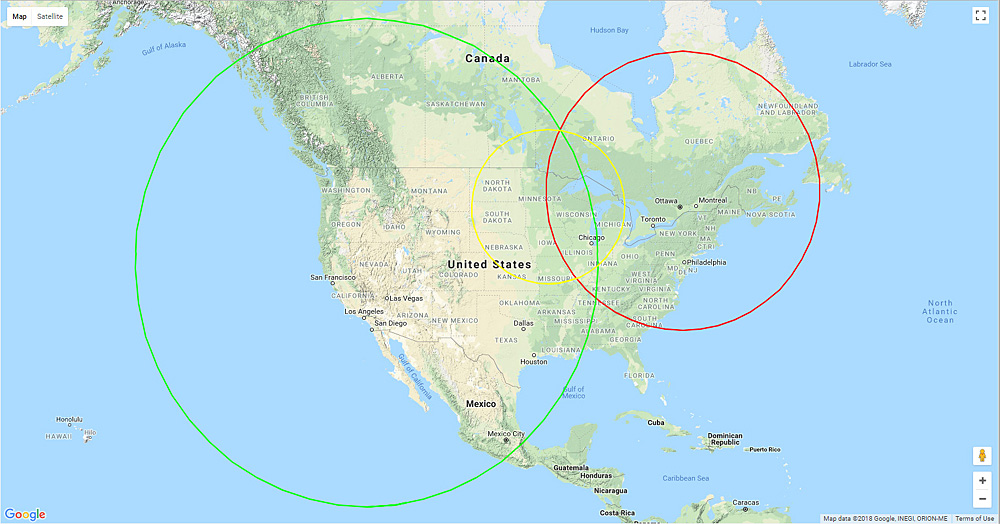
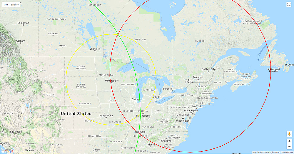
Uncorrected maximum range rings
For GrahmC, near Ottawa, Canada, we have only a single measurement. For Skeezix, near Minneapolis, MN, and for myself (Token) in the Mojave Desert of California, near IYK, we have a range of measurements. These ranges are probably caused by changing propagation delays and multipath.
The following images are range rings plotted with no consideration of the altitude of the reflective layer of the ionosphere, and no attempt to correct for path length increases due to propagation. They are just range rings plotted based on time of propagation, and they are worst case, maximum possible, ranges. The actual value will be something less than what is plotted here, the rings should be a little smaller.
In other words, the target will probably be someplace inside the common, overlapping, area of all three rings. It should be skewed towards the points of intersection of the rings.
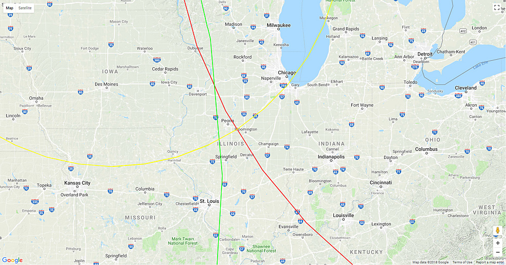
The rings are color coded. Skeezix rings are Yellow, GrahmC rings are Red, and my rings are Green.
The overall map, note that the intersection to the north is fairly tight. This might lead someone to believe that is the source location. However I believe the actual source location is near the lower, more scattered, intersection.
Zoomed in view of the same plot above.
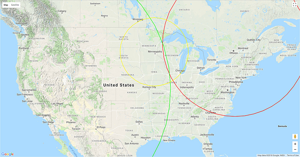
Corrected range rings
The following range ring images are loosely "corrected" to compensate for the added distance of skywave propagation. Skeezix should have ground wave or at most single hop propagation (the shortest numbers are assumed to be ground wave), GrahmC should have single hop, and I should have single or double hop. Very rough correction was made for the single and double hop deltas.
The rings are color coded. Skeezix rings are Yellow, GrahmC rings are Red, and my rings are Green.
The overall map.
Zoomed in view of the same plot above showing the area of the southern intersection.
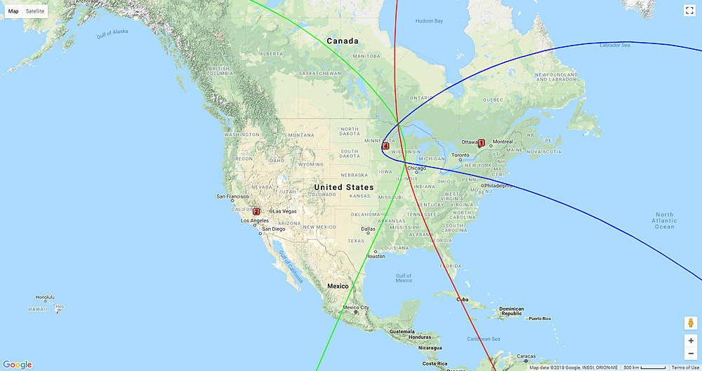
TDOA
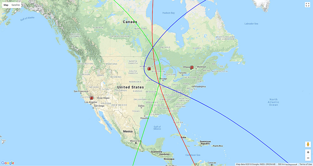
Time Difference Of Arrival curves, uncorrected and corrected as above, were plotted for the three pairs of receive locations.
The curves are color coded. Skeezix vs Token curves are Blue, Skeezix vs GrahmC curves are Green, and GrahmC vs Token curves are Red.
TDOA Uncorrected plots.
The overall map. Since two pairs pf stations will have hop or multiple hop sky wave propagation, and one may have no hop, these intersections are probably pushed out a bit, a tad long.
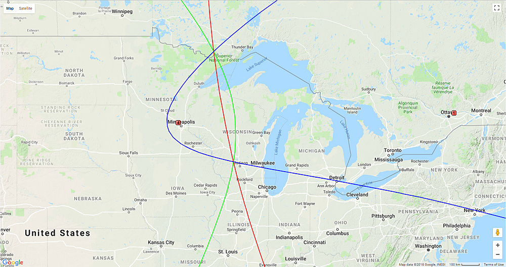
Zoomed in view of the same plots.
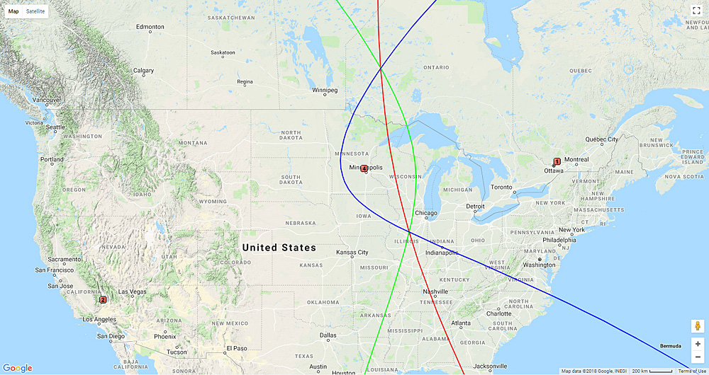
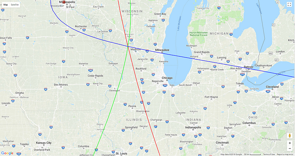
Zoomed in view of the same plots, centered on the southern intersection.
TDOA Corrected Plots.
As for the Corrected Range Rings, a rough normalization was done to try and remove or reduce the variations of propagation. Since the receive locations were at vary different ranges form the target, the measurements were done on different days and frequencies, this normalization is, at best, "loose". It is mostly done to show the potential variations.
The overall map.
Zoomed in slightly on the overall map, still showing both intersections.
Zoomed in and showing only the southern intersection.
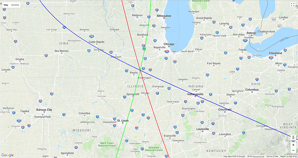
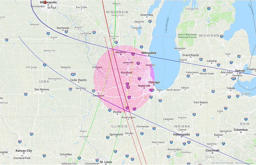
Both Corrected and Uncorrected TDOA plots, on a single map. This shows both TDOA plots and the area they encompass. If I was a betting man I would say there was a pretty good chance the source is in or near the highlighted area of this map.
T!